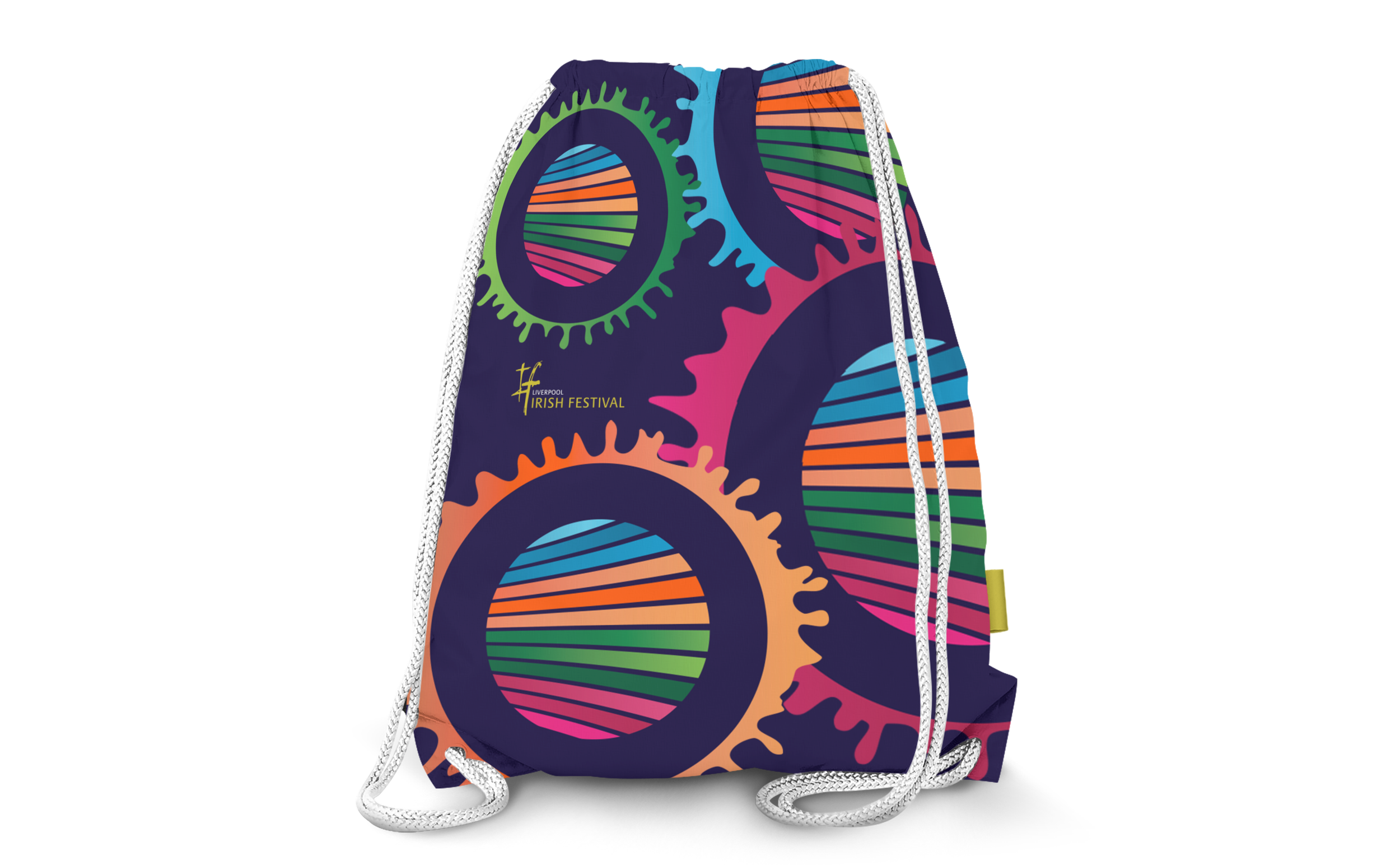

This campaign promoted a major cultural festival in Liverpool backed by the City Council. The creative solution focuses on the event’s acronym, IF (Irish Festival). IF is used, either directly or indirectly, to pose questions in the mind of the audience, to provoke thought and to excite people about the possibilities that the festival offers.
Liverpool Irish Festival
brand identity / print design / marketing campaign / promotional items


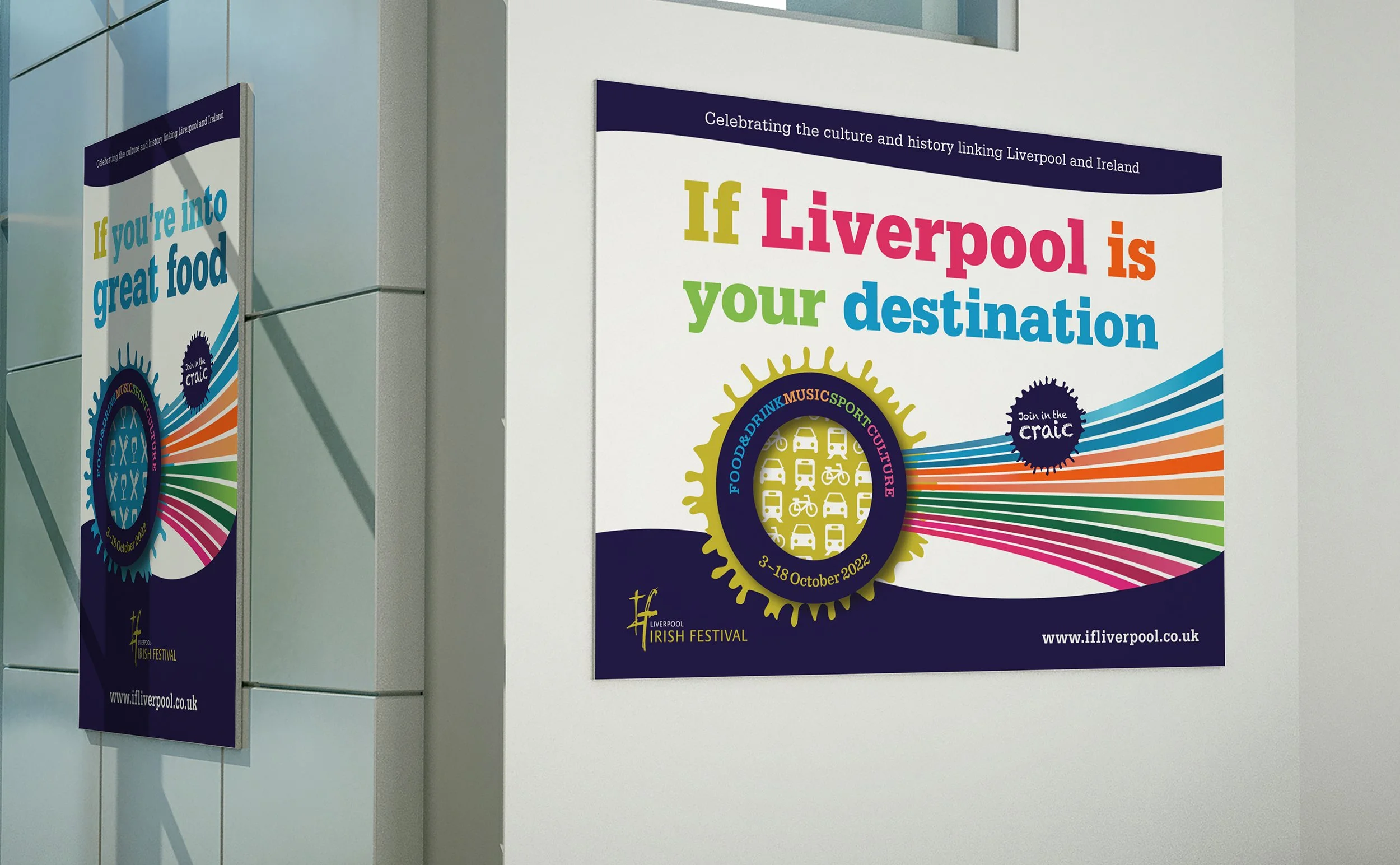

The concept is further brought to life through the ‘GO-TO’ graphic. It’s comprised of four sets of paths in colours representing Sport, Culture, Music and Food & Drink. This gives each area its own identity and voice. The lines lead to a circle representing Liverpool and the Irish festival itself. The curvature reflects the port and river Mersey.